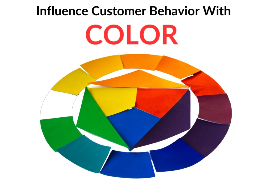
As a business owner, you’re constantly looking for ways to stand out and attract customers. Have you ever considered the impact of colors on your business signage? Believe it or not, the colors you choose can significantly influence customer behavior. Understanding the psychology behind colors in signage and leveraging color contrast can be a game-changer for your business.
Colors have a profound psychological impact on human emotions and perceptions:
Emotional Triggers: Colors have the remarkable ability to evoke emotions. Warm colors like reds, oranges, and yellows often create a sense of urgency, energy, and excitement. This is why they’re frequently used in clearance sales or promotions. Conversely, cool tones like blues and greens convey calmness, trust, and reliability, making them a preferred choice for businesses such as financial institutions and healthcare, in order to build a sense of security or professionalism.
Brand Association: Consistent use of colors in your signage helps in brand recognition and association. When customers repeatedly see specific colors associated with your brand, they start to subconsciously link those colors to your products or services (think brands like Coca-Cola red or UPS brown). This association helps in establishing brand identity and can influence purchasing decisions.
Cultural Significance: Different cultures perceive colors differently. For instance, while white symbolizes purity and weddings in Western cultures, it signifies mourning in some Asian cultures. Understanding the cultural significance of colors is crucial, especially for businesses with a diverse customer base or those expanding into international markets.
Call-to-Action (CTA): Certain colors can prompt specific actions from customers. For instance, the use of vibrant and attention-grabbing colors like red or orange in CTAs can stimulate immediate action, like clicking a button or making a purchase. On the other hand, softer tones may encourage a more relaxed or thoughtful response.
Impact on Impulse Buying: Colors can also influence impulse buying behavior. Bright and striking colors often attract attention and can encourage customers to make unplanned purchases, especially when strategically placed or used in promotional signage.
But it’s not just about choosing the right colors; it’s also about utilizing color contrast to increase visibility. Color contrast helps to enhance the visibility and legibility of signage, capturing attention in a world of distractions. By combining colors that are distinctly different, businesses can ensure their messages are seen and comprehended swiftly.
High-contrast combinations, such as black on yellow or white on red, create visual impact and draw immediate attention. This stark contrast allows the text or images on the signage to stand out boldly, even from a distance, making it easier for people to read and engage with the content. This visibility is crucial, especially in high-traffic areas where you want to capture the attention of potential customers swiftly. Additionally, leveraging contrasting colors strategically doesn’t just improve visibility but also aids individuals with visual impairments, ensuring inclusivity in communication and maximizing the reach and impact of the signage for all potential customers.
Partnering with a professional sign company like Precision Signs & Imaging is essential. Our experts understand the nuances of color psychology and the art of creating impactful signage. We can guide you through the color selection process, ensuring that your signage not only aligns with your brand but also effectively influences customer behavior.
Your signage isn’t just an announcement; it’s an opportunity to connect with your customers on a subconscious level, and we’re here to help you seize that opportunity. So, when it comes to creating impactful signage that resonates with your audience, let Precision Signs & Imaging be the key to unlocking your business’s full potential. Precision Signs & Imaging … because image is everything.


